Color crush: poppy, navy, coral, mint

When Andy and I started building Burritos and Bubbly, we divided our strengths. Andy is what I call “meat and potatoes” — he knows how to do the techy coding part — and I’m more of the “sauce” — I love thinking about colors, fonts, and design.

Choosing just the right colors was really important to me and I put a ton of thought into different combinations. No kidding, I literally couldn’t sleep at night just thinking about colors! I wanted our site to be fun, bright and cheerful, just like us, and since this is a blog for both of us, I couldn’t go too pink (but maybe a little pink??). Over and over I found myself coming back to the perfect shade of poppy. Is there a more perfect color than that bright orangey red? Combined with mint, navy and coral, this is my new favorite color palette, and it’s exactly what we wanted for Burritos and Bubbly.

BandBcolors

This is the color palette I came up with for the blog and what we used to create the colors for all of the buttons. I like to create a little moodboard in photoshop just so I have everything in one easy place to go back to. And photoshop makes playing with colors so easy.

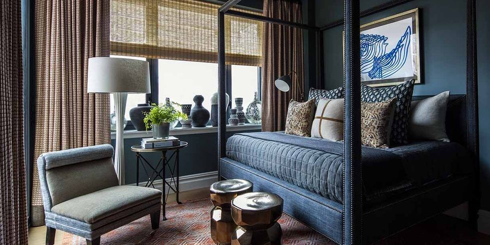
This color combo is perfect for interiors, and dresses, and so many other things, too. I can’t get enough!

poppy4

poppy

poppy2

poppy3

poppy5

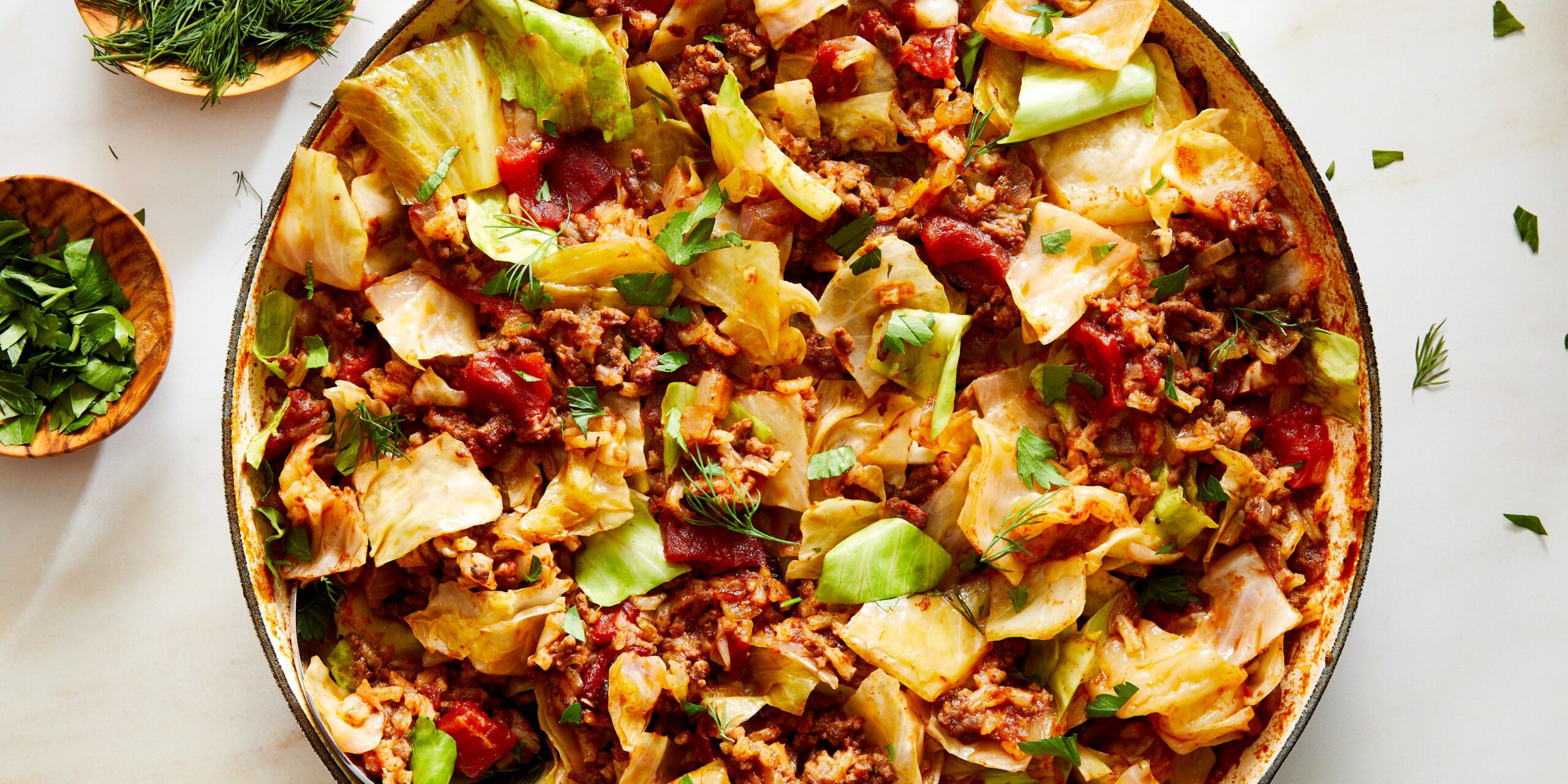
{ one and two }
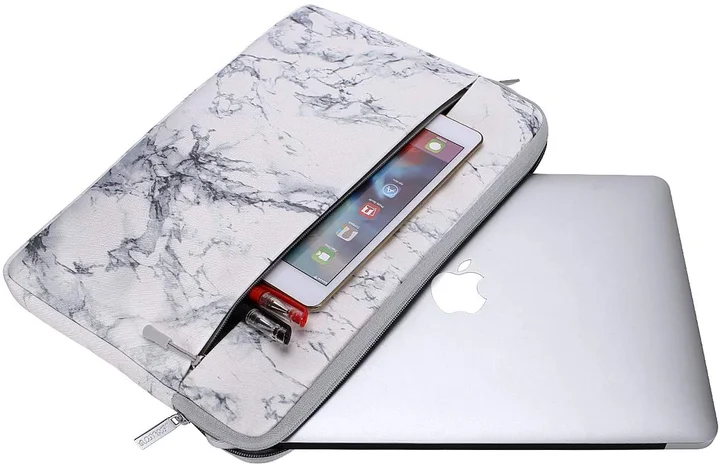
{ three and four }
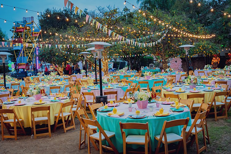
{ five }
{ six and seven }
eight and nine }

| Filed under Design & Inspiration | Tags: , ,

2 thoughts on “Color crush: poppy, navy, coral, mint

Leave a Reply

Your email address will not be published. Required fields are marked *