June 19, 2026
It’s Probably Been Years Since You Organized These 7 Spots in Your Home—Experts Say It’s Time
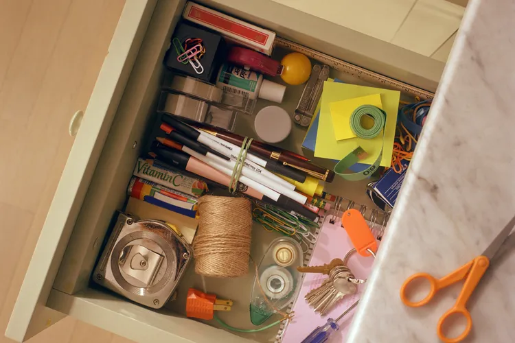
Home organization isn’t a one-time project—it’s an ongoing cycle of clearing, sorting, and rebalancing. There’s always some drawer or cabinet that could use attention. Most areas eventually get their turn. But then there are the forgotten zones—the spaces and objects that slip out of awareness entirely....